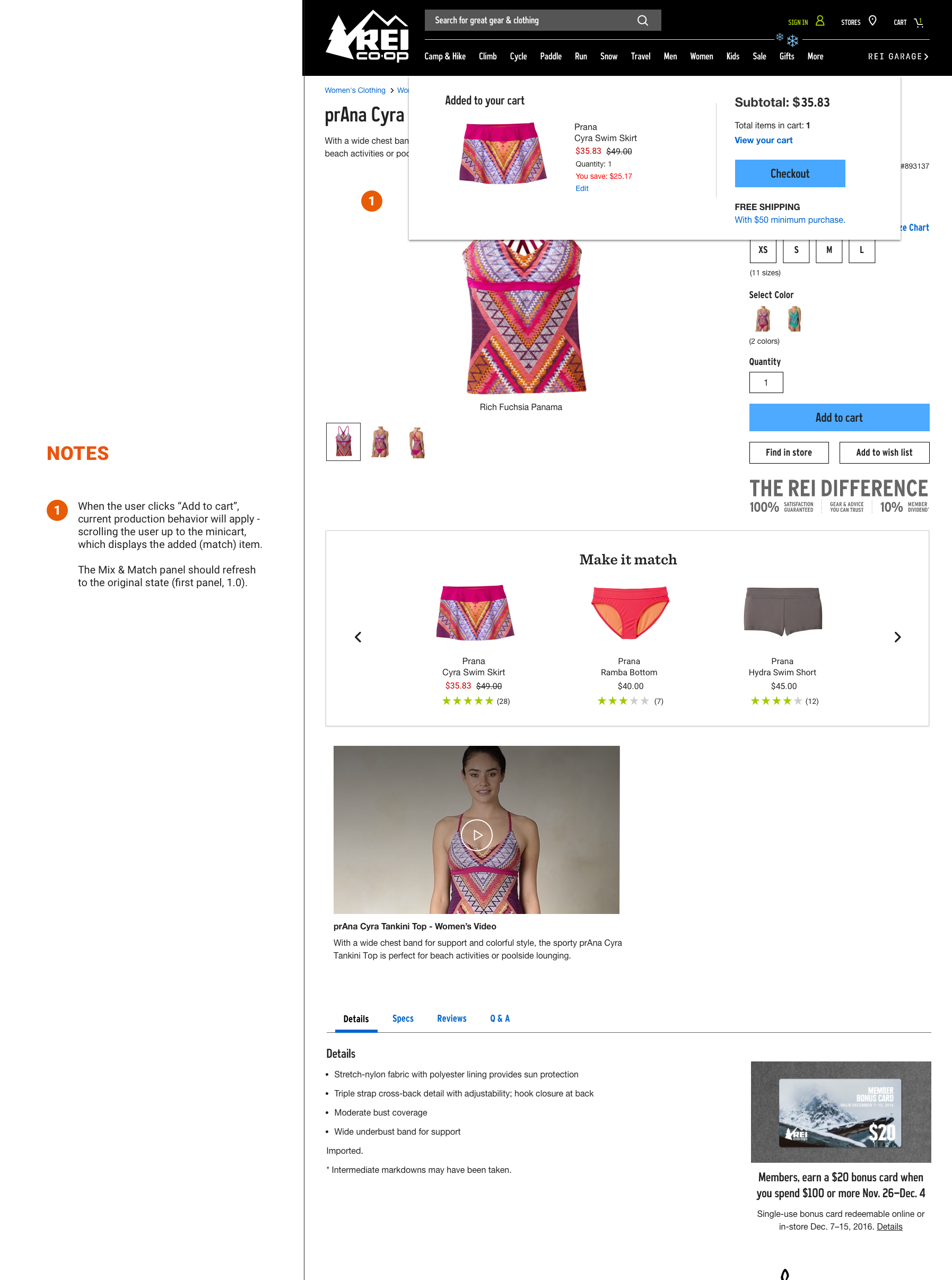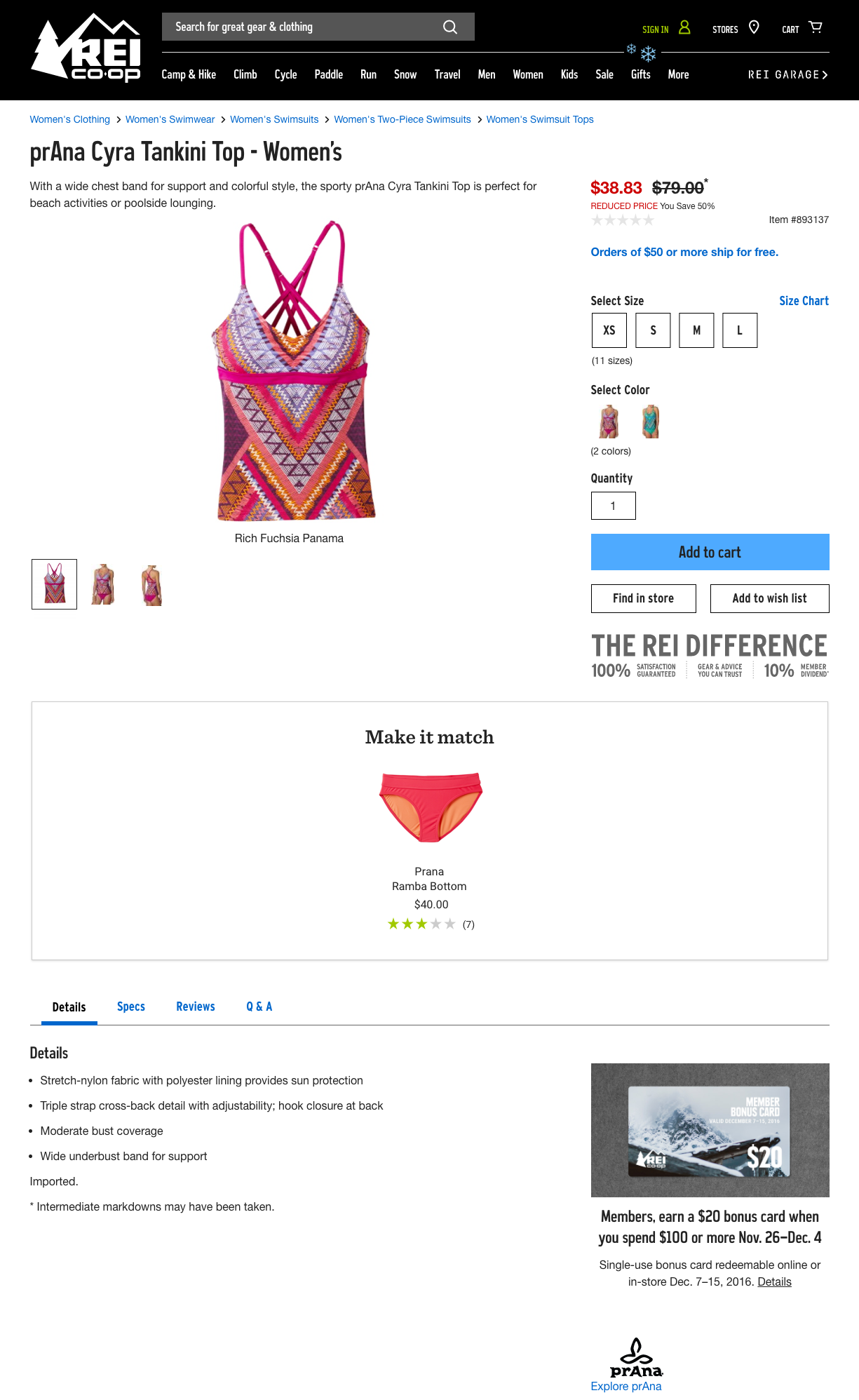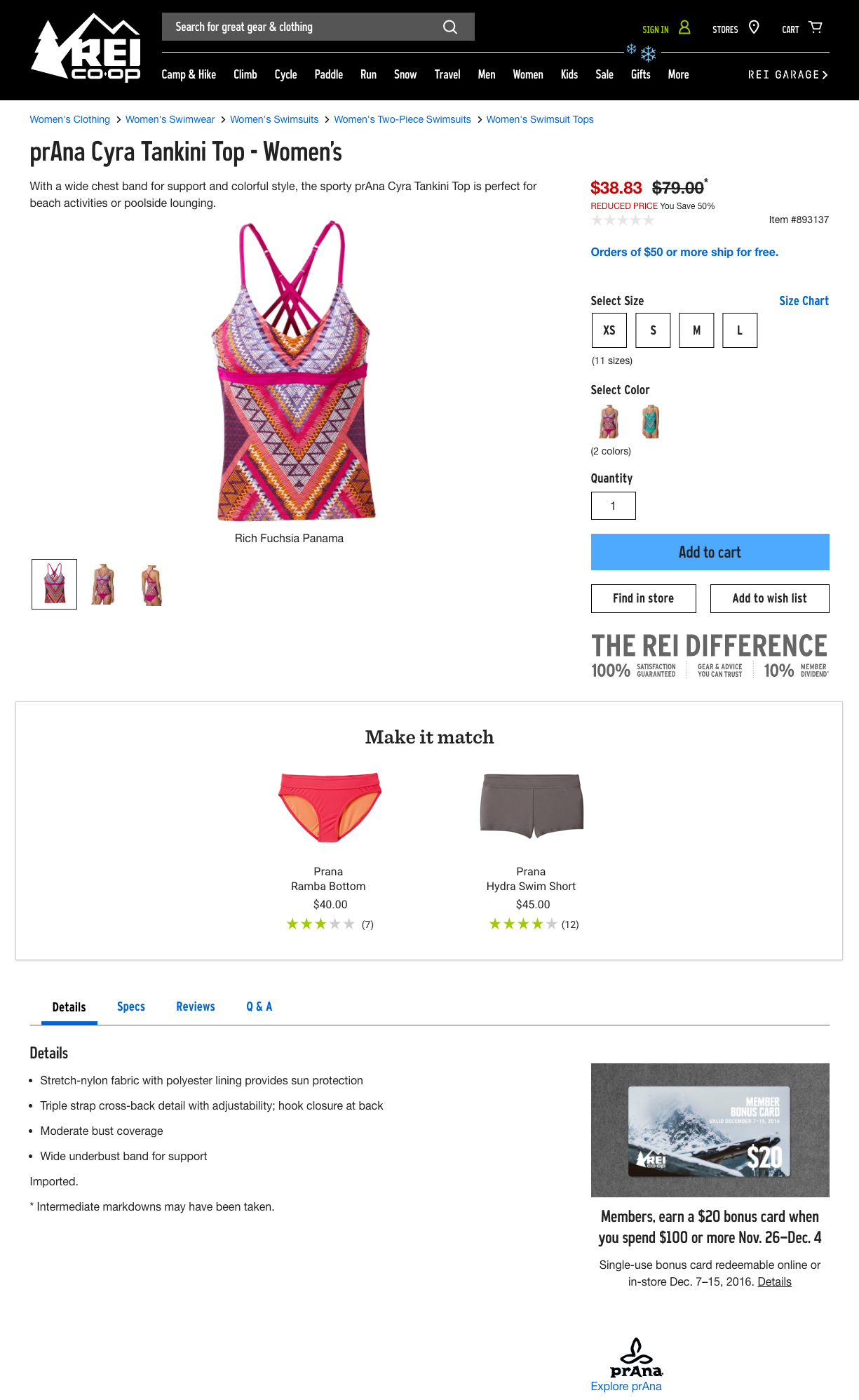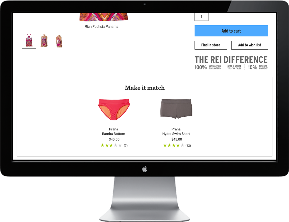
REI Mix-n-Match
Outfitting for Swim Apparel
Our apparel team was excited to introduce a new wider range of swim apparel for the upcoming season. We wanted a way to showcase the variety throughout each swim brand and the various ways they could be worn together.
While this work did not increase sales for swimwear on its own, it paved the way for more meaningful outfitting & collections opportunities and created a baseline for this work to be built upon.
Duration: 1 month
My Role: UX Research & Design, UI Design
THE PROBLEM
Swim and Baselayer product line sales are becoming more crucial for REI and the digital space. Baselayer, part of our Heritage category, is a core product for REI, swimwear is seeing a material investment in the coming years with aggressive digital growth goals. However, the digital shopping path for these types of products (matched, pairs, mix & match) can be challenging for any digital retailer and results in a poor customer experience. REI is no exception.
THE PROcess
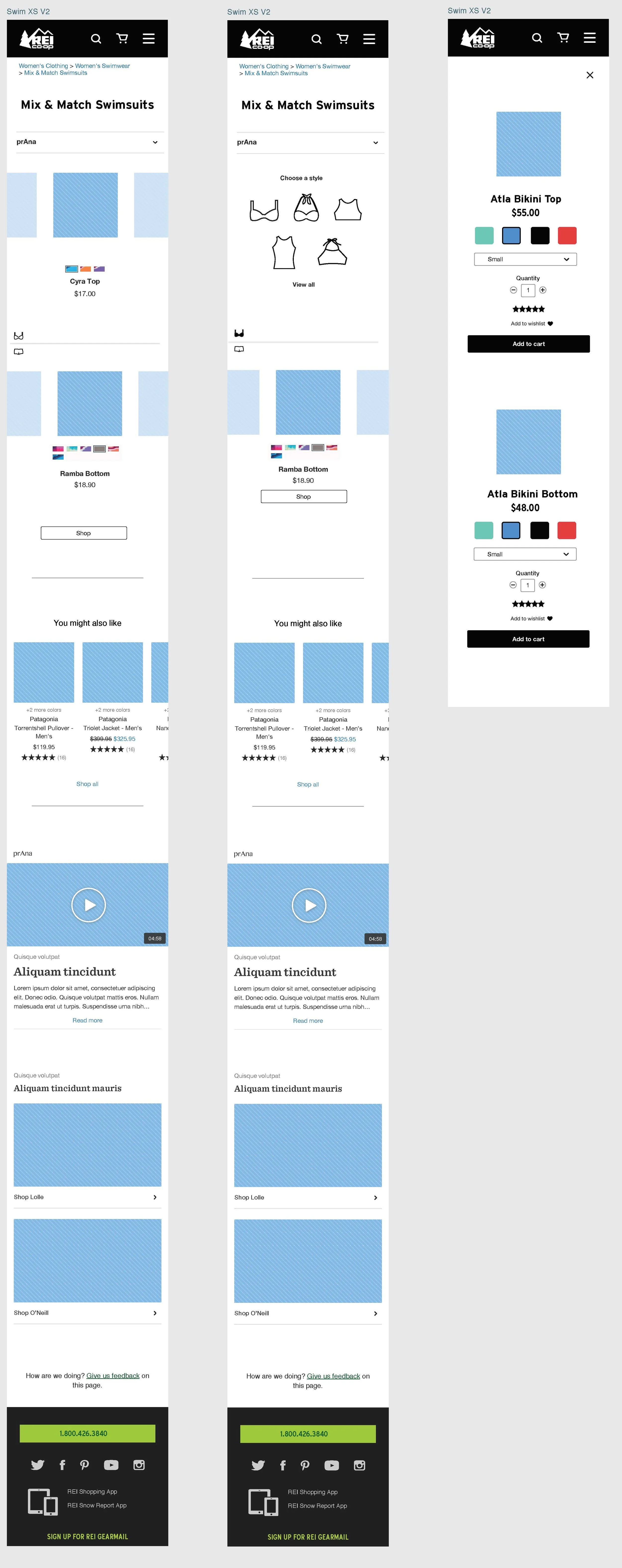
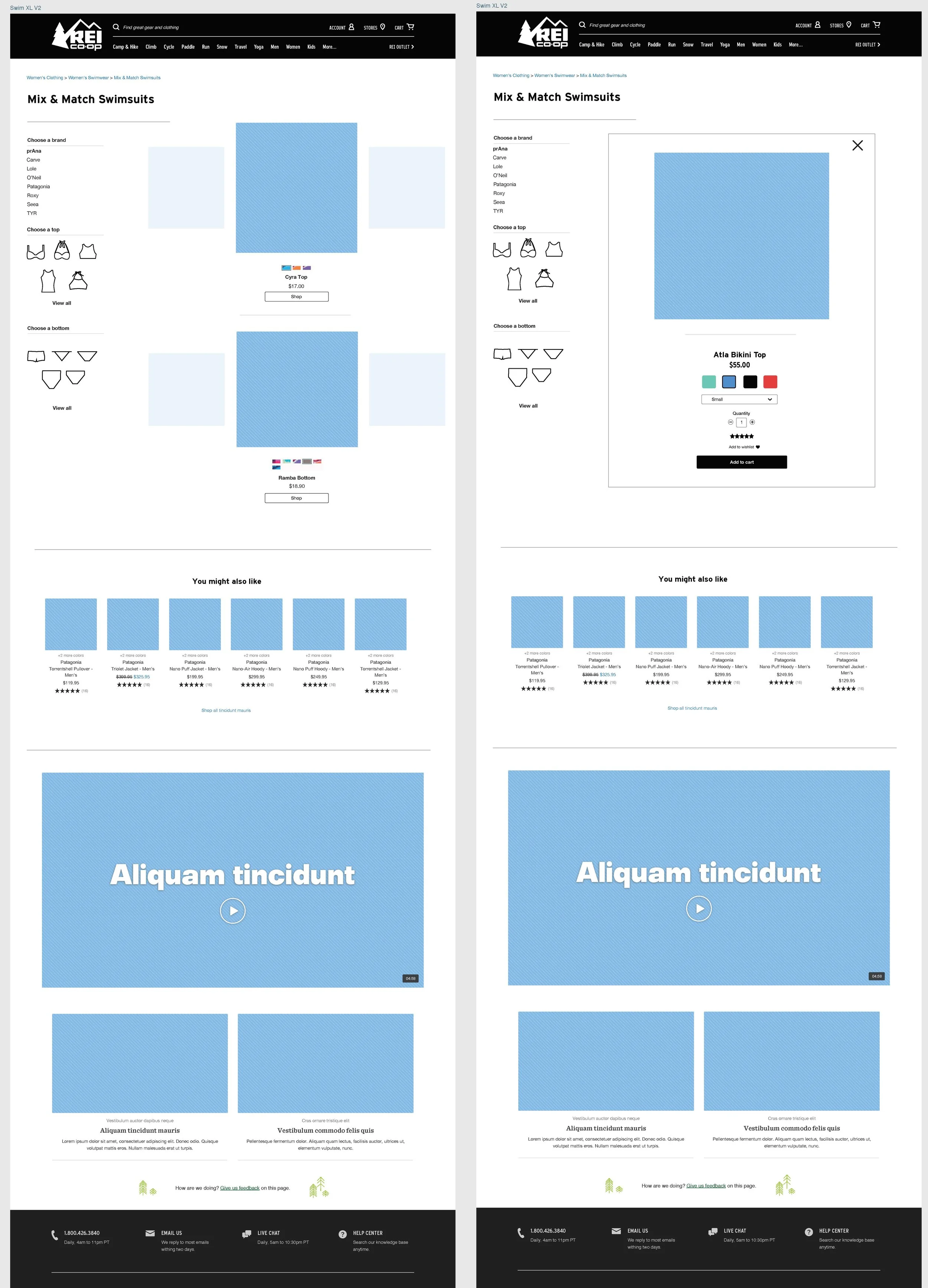
Stakeholder interviews were an extremely important place to start. We started by interviewing each of our three internal stakeholders to determine what success would like like. Once we established our internal baseline, we began doing competitive research; who is showing swimwear (in january no less!)? Who is doing it well? What could be improved? How is outfitting and accessory items being shown, if at all?
We pulled various web experiencesinvolving swimwear (including REI) to create a scenario based test via usertesting.com to help get a better understanding of what our REI customers were looking for. Once testing was reviewed we saw a clear opportunity to help our customer find the right brand and fit match - after all, black is not black from vendor to vendor. We determined that by outfitting our customers with a specific brand we could keep patterns consistent. We would allow our vendors to suggest matches and curate those suggestions within a small subset of products to further A/B test once launced
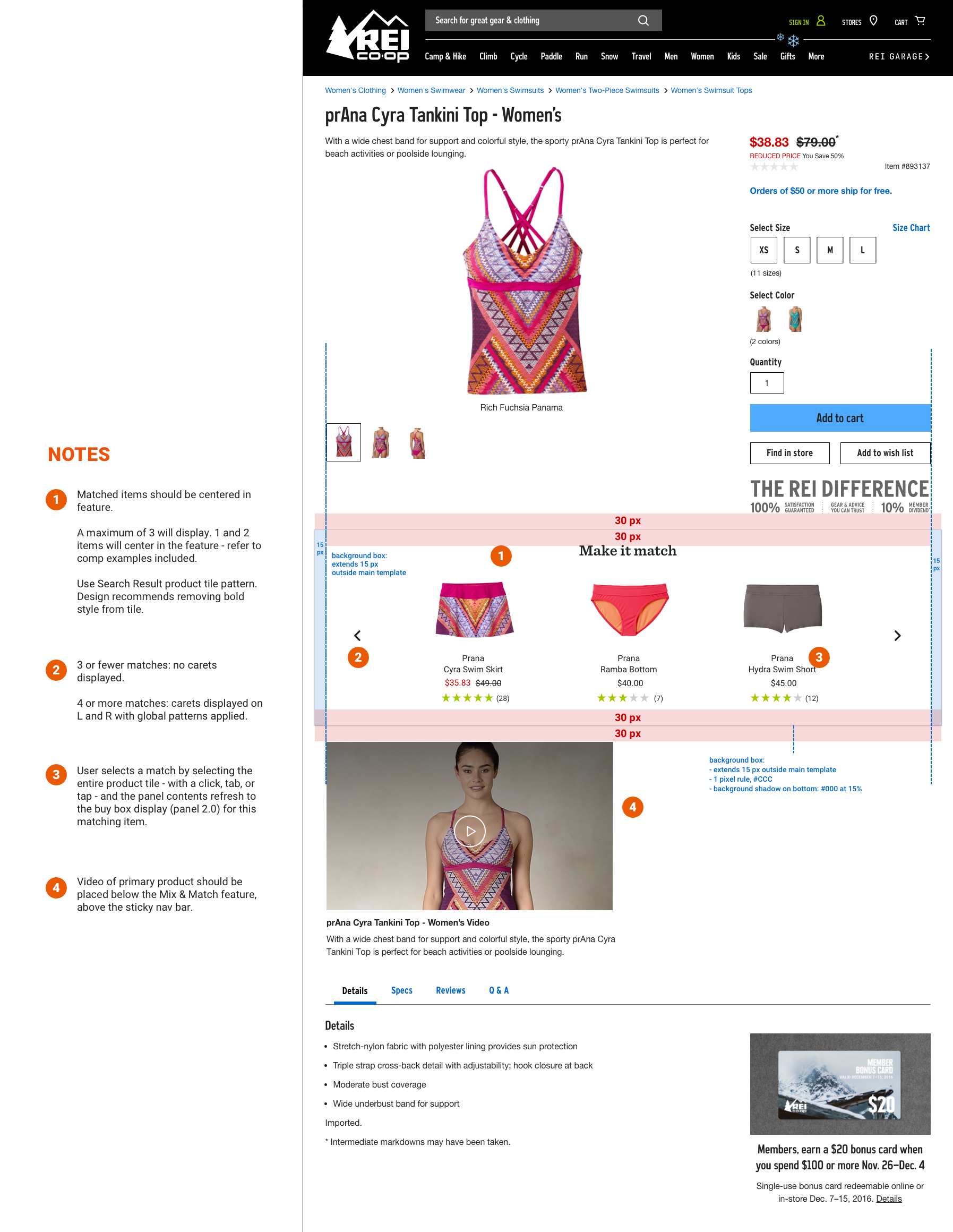
We began designing with a Good/Better/Best mentality. Whiteboarding design sessions with 3 designers helped to guide the experience and brought new ideas to the table. By using quick design sessions we were able to quickly veto or move forward with a particular element.
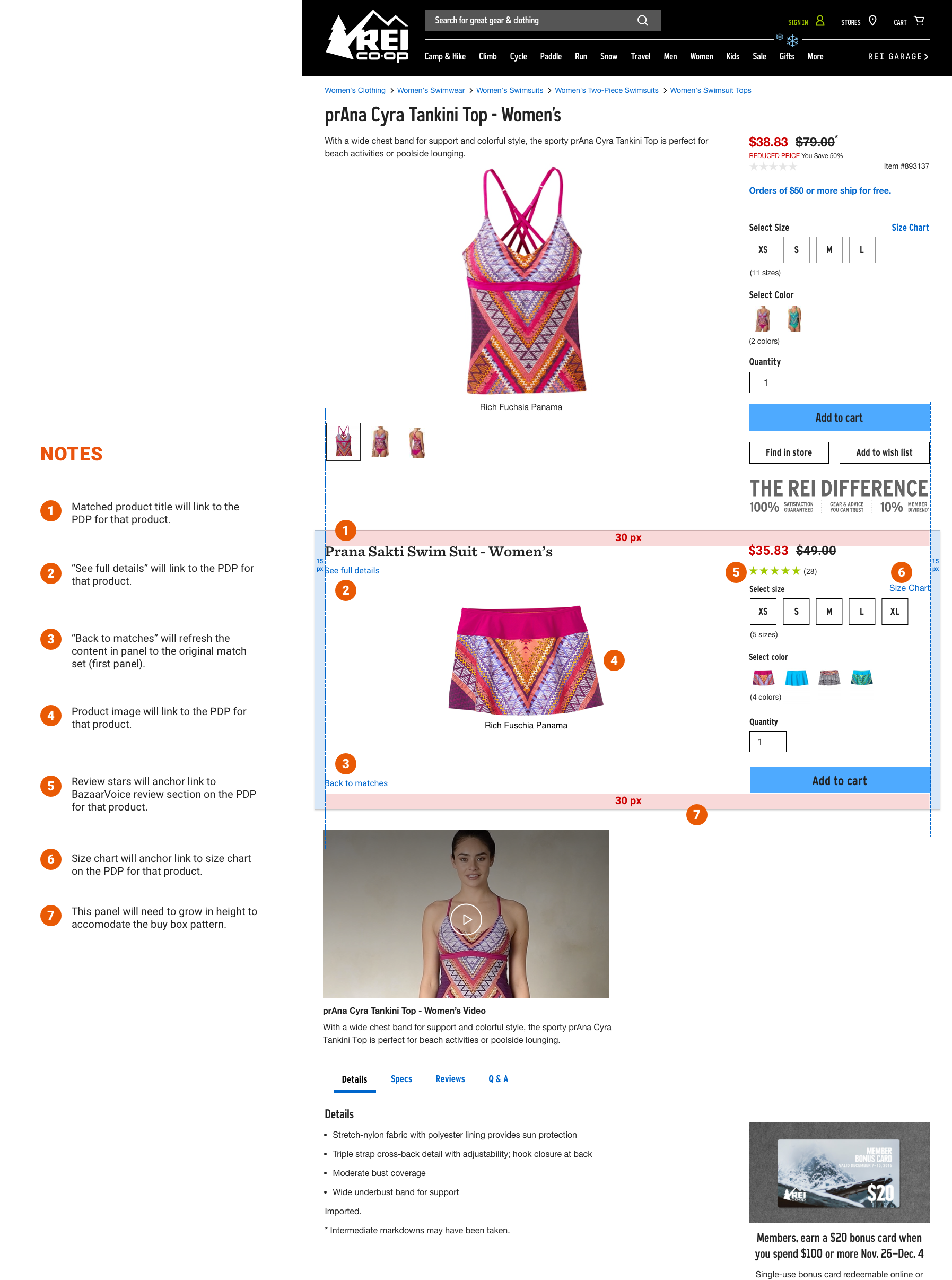
Once our final concept was decided upon, we created a prototype to further prove/disprove our designs and how they function. We tested 5 users on mobile and 5 on Desktop. We wanted to determine desirability, understanding and flow. Specifically asking our users to go back and forth between multiple scenarios and items to test; What worked & what didn't? Does the user understand the flow? Do they get lost?
Once pain points were identified we quickly iterated and refined the designs for further testing in store.
I created a hi fidelity prototype using Axure to mimic a real life shopping scenario. Additionally I created a test plan and script to make sure our test would stay on track. 6 REI customers from the Seattle Flagship store were tested using this script and we were able to identify a high desirability for the product. In addition, our testing revealed a need for more fit guidance to help our customer find the right style and fit. These findings lead directly to an upcoming body of work.
THE Solution
Our team created an outfitting experience focusing on the product detail page. We started with a basic level of interaction with plans to iterate upon our learning from this experience as part of a 2018 Spring/Summer outfitting experience. Although this particualr solution did not increase sales, it did increase recognition in our customer base.